Utility @ GQ
This project aimed to improve the experience and display of content on the website, create a flexible system of reusable components and bring an element of utility and service to our high-trafficking index pages. Ultimately give users the ability to turn GQ’s inspiration into action to broaden our reach, reinforce habit and accelerate revenue.
Product Design · Branding · UI Design
The Problem.
Limited Engagement: GQ relied on reverse chronological river templates to showcase all content.
Hard to find specific content: Other than a editorially curated hubs, the experience didn’t offer users any way to engage with specific content
Evergreen content gets buried: GQ’s didn’t dedicate any real-state to allow evergreen relevant content to remain in the surface
Product didn’t properly support Franchises: GQ had no way to elevate franchise-based content as special.
Limited purchasable opportunities: Products could only be viewed on galleries or stories.
Users bouncing to search: GQ experienced relatively high traffic in channel pages, however it also saw a high percentage of users bouncing off to search as consequence of not finding specific content.
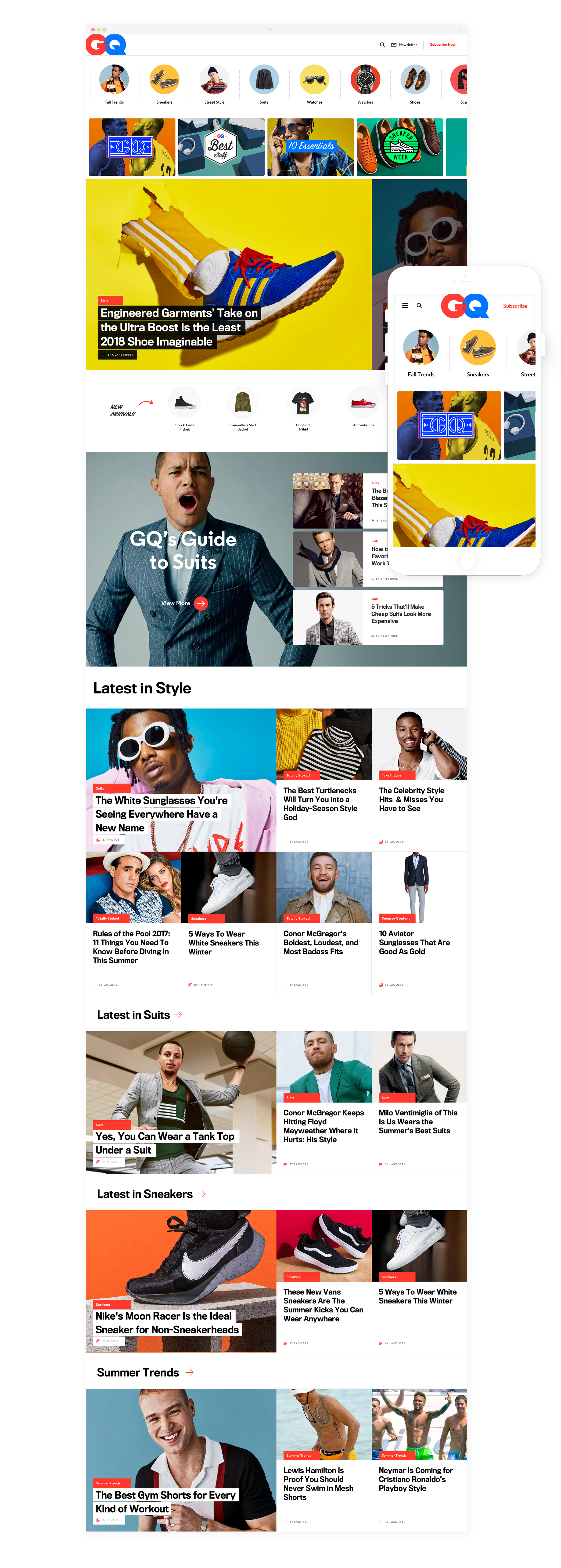
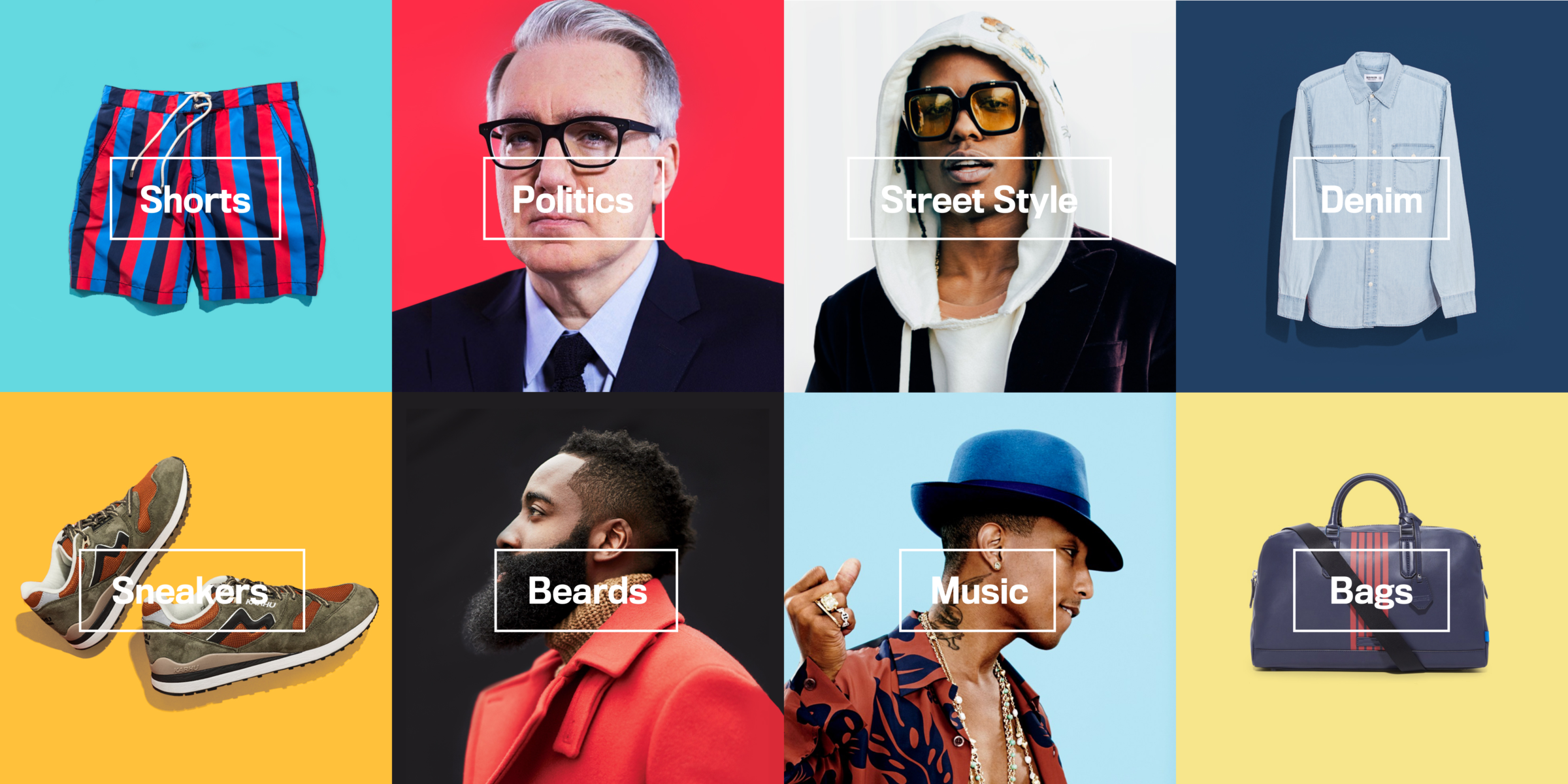
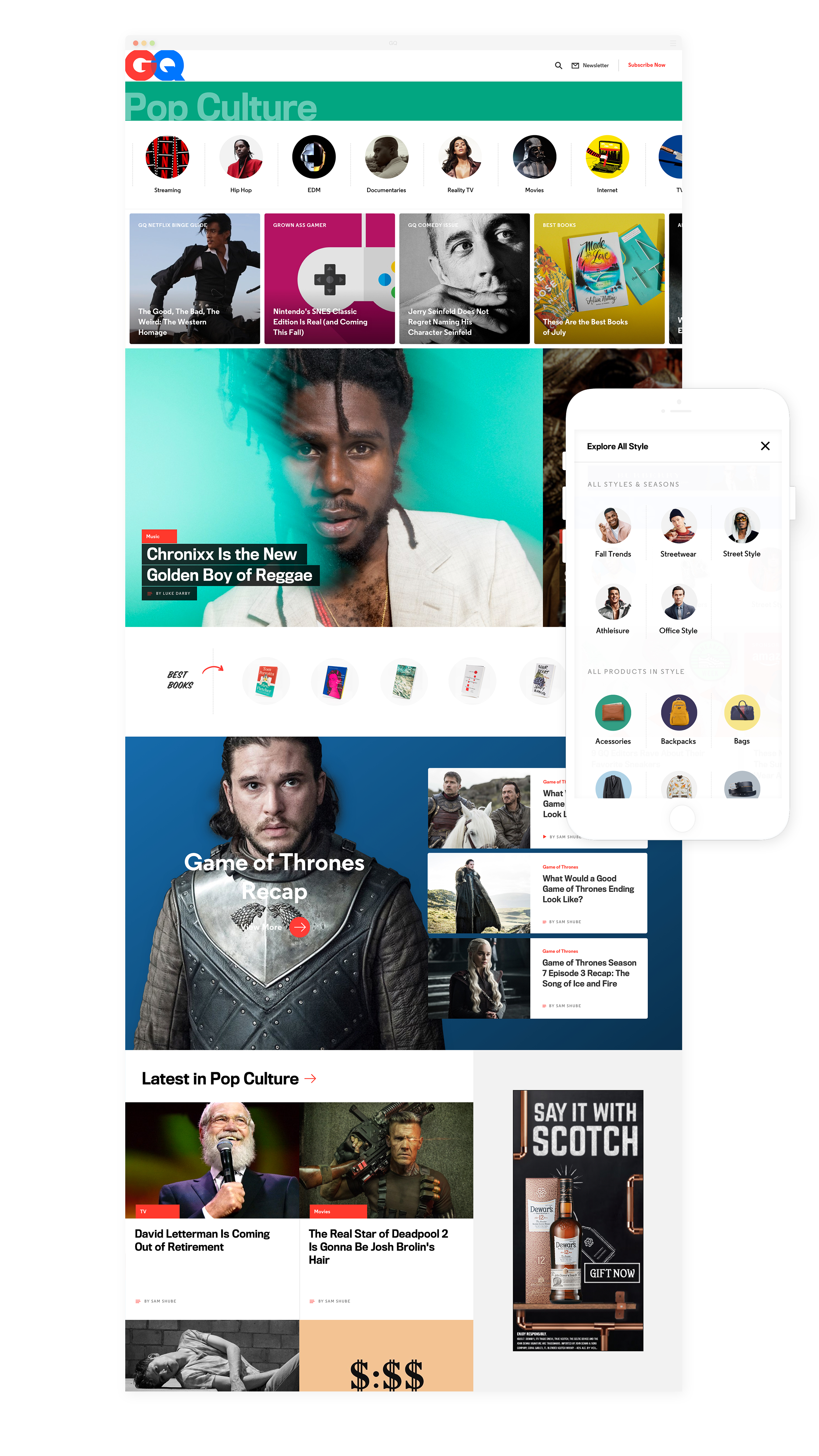
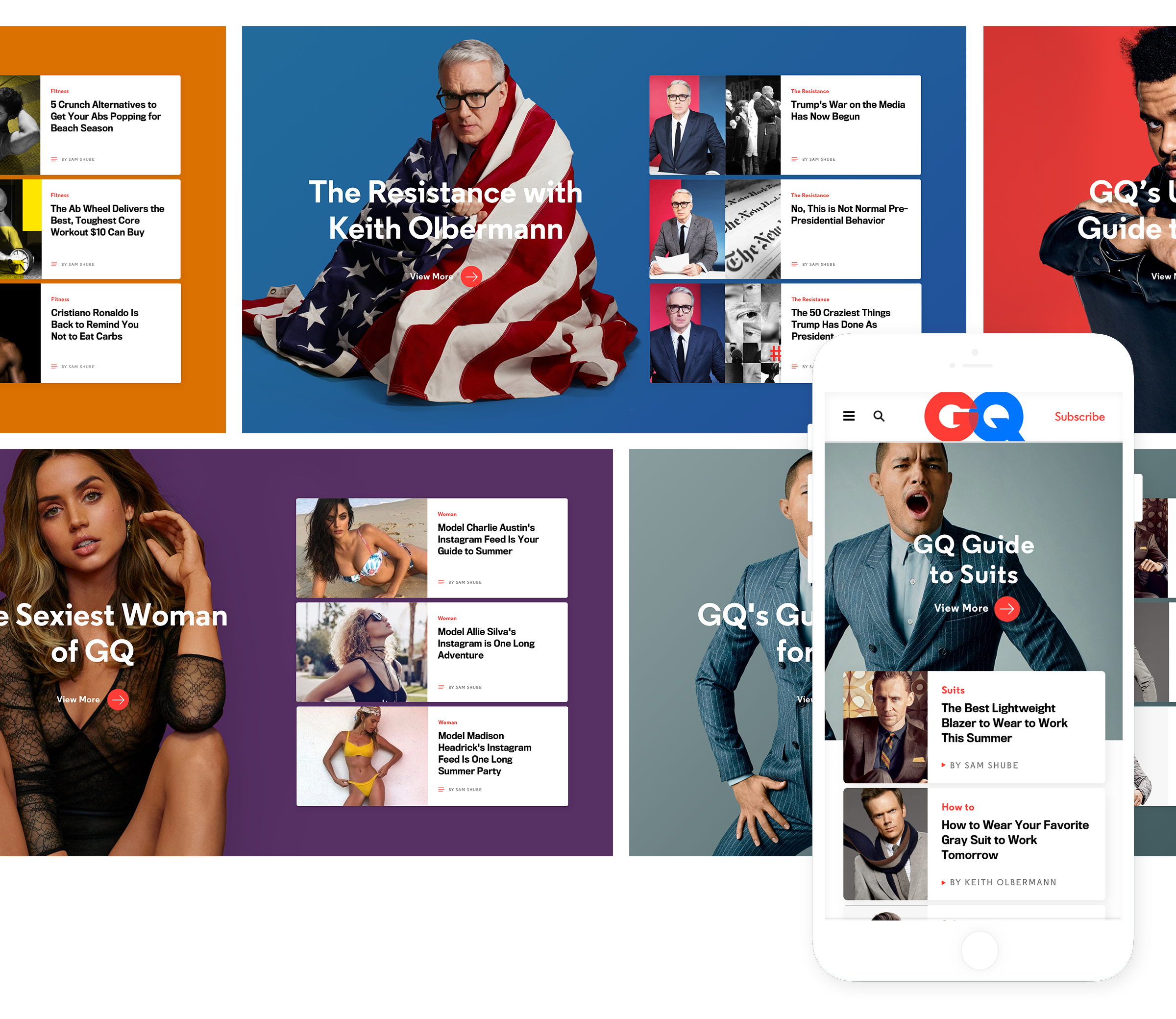
Channel Redesign.
We’ve seen increase in daily visits to our channel landing pages, as well as increase in traffic directed to our franchise and hub pages.
Increase average click-through to content
From 74% to 80% (10% increase)
Increase average click-through rate to other category pages
From 8.85% to 13.3% (50% increase)
Increase Average Time-Spent:
From 7.6 mins to 9.6 mins (25% increase)
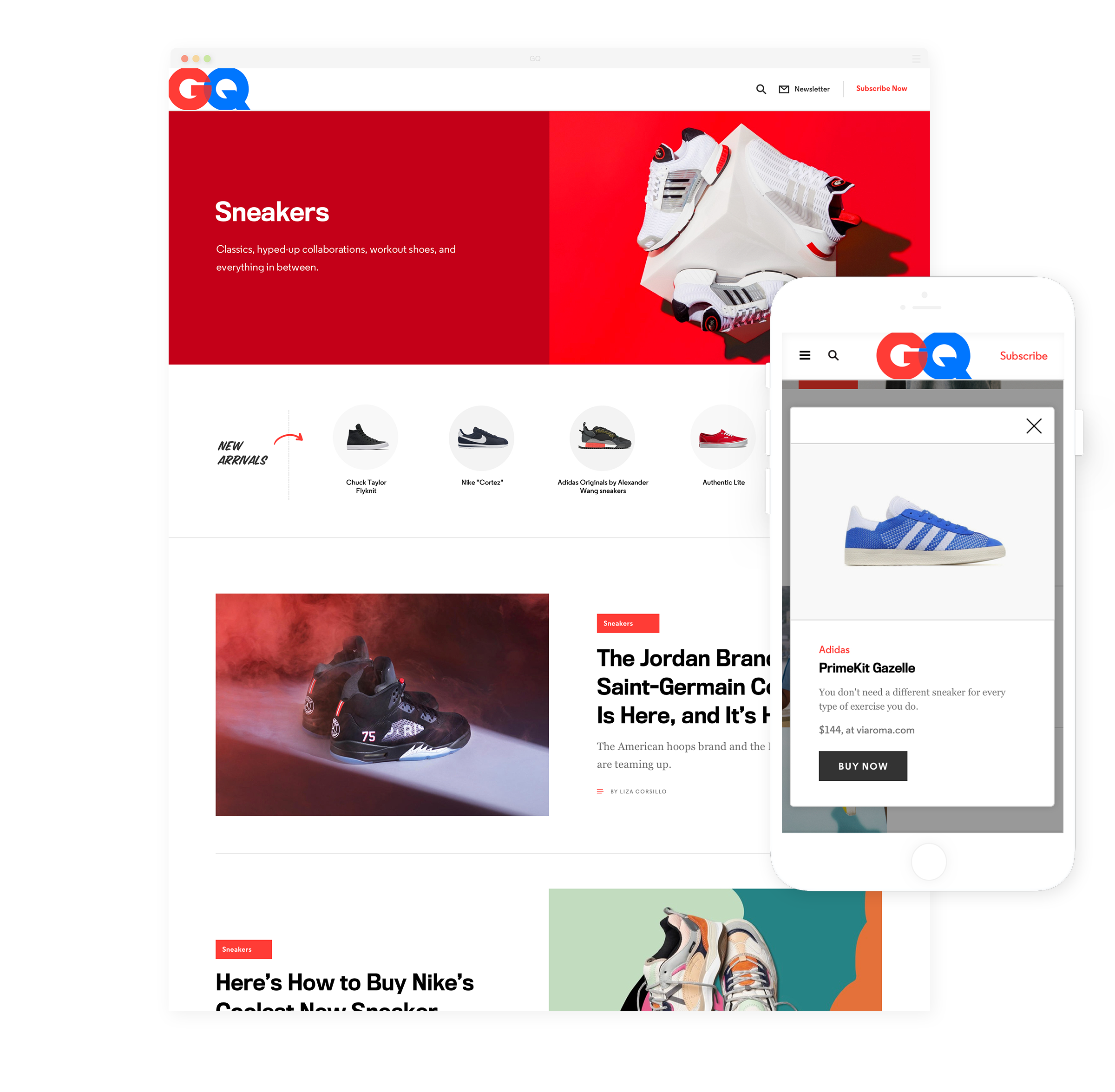
Product Integration.
GQ knows that our loyal audience comes back for fashion, style, and grooming advice and recommendation. Without making users go into an article or gallery, we’ve opted to present product recommendations on it’s respected sections. All these products are endorsed and tested by our team of editors.
These new features allowed GQ to offer more actionable commerce moments at all leves of the website experience. This work set the foundation for a more ambitious dive into the world of commerce – GQ Recommends.

User-Driven process, from beginning to end.
This project was approached holistically, starting in January 2017 with a market Survey, going through User Interviews, Competitive Analysis, Ideation, Prototype, User Testing until we finally hit our proof of concept components.
The project would be impossible without the incredible talent of Doug Seidman, head of product and Hugo Broche, Design Director.

